Game Design 1 Week 9 Polished Environment
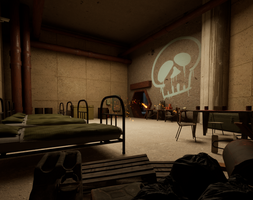
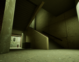
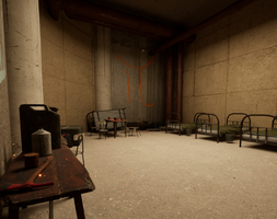
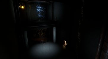
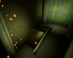
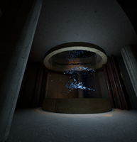
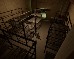
For the past 3 to 4 weeks (I can't recall, time is a blur this time of year), we have been working on making a bunker. The purpose of the bunker this time around was to make a polished area. Often in our design classes, the games and environments we make are a bit on the... sloppy side. It's important to try new things and get ideas out quickly, but in an industry like ours, it's crucial to be able to polish your creations as well. I really appreciated having the time to focus on making something feel complete. I honestly think the best stuff I make is the stuff I'm able to spend the most time on. Though I did learn about some mistakes to avoid for the future too...
Key Takeaway 1: Modularity exists for a reason! Plugging materials into my gray boxing assets as my final assets was a mistake! Sure, those Quixel assets look really nice, but not if they're super stretched out! I had to do a lot of covering to make sure that everything looked coherent. Kids, if you learn one thing from me, it's don't stretch your textures. That breaks immersion immediately.
Key Takeaway 2: Lighting and color is everything. It's strange how directly color effects our emotions. I wanted to give some of the rooms (the storage and the bedroom) a more comfortable feeling. So, I made sure the light in those rooms were very warm. This way, they would invite the player in. When I was fiddling around with the lights, I would occasionally remove the color. The rooms felt so empty and sterile without the proper lighting color! I'm never making an environment without lighting, color, and emotional impact in mind again.
Key Takeaway 3: It's good to have a little story in your environment. Perhaps, "Environmental Storytelling" is a bit of an overused term these days, but it's been so impactful for a reason. For one, it serves as great inspiration for your environment. For two, it makes a space feel complete. Suddenly, when you have a reason for WHY your assets are there and HOW they got there, the environment really steps up a level. And it isn't even a tough thing to implement. I mean, sure, I respect games like Edith Finch for making every asset have it's own story, but that sort of detail isn't applicable for every kind of game. Just getting 50% the way there was enough to really flesh out the environment.
Anyway, making all of this has been fun... Looking forward to making some terrain in the future!
Files
Get Game Design 1 Unreal Project
Game Design 1 Unreal Project
Fall 2024 Semester Project to show everything I'm learning!
| Status | Released |
| Author | Dameron Cook |
More posts
- Game Design 1 Week 16 Final UpdateDec 08, 2024
- Game Design 1 Week 11 Overworld DesignNov 04, 2024
- Game Design 1 Week 5 Applying FeedbackSep 18, 2024
- Game Design 1 Week 4 Essential Emotional ExperienceSep 14, 2024
- Game Design 1 Week 3 AudioSep 06, 2024
- Game Design 1 Week 2 Lighting, Materials, and TimelinesAug 29, 2024
- Game Design 1 Week 1 Update/LaunchAug 22, 2024
Leave a comment
Log in with itch.io to leave a comment.