Game Design 1 Week 4 Essential Emotional Experience


This week, we were tasked with developing an experience that delivered on a specific emotion. For this project, I decided to focus on making a, "Somber," game. With creating a somber experience in mind, I quickly wracked my brain for different sources of inspiration.
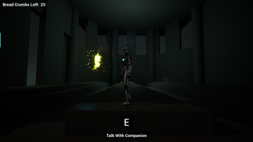
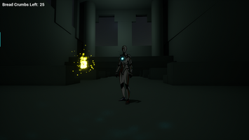
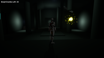
I've always loved exploring small worlds with lots of details and heavy stories to dive into, so I thought that I would try to recreate that. My largest inspiration behind that was The Last of Us Part II's Downtown Seattle. Downtown Seattle has a massive scale and an engrossing environment, and I wanted to recreate the things I felt of investing myself in its world. To try and recreate the feeling of scale, I decided to start the player in a claustrophobic area. Once they get out, they're met with a huge palace to discover. I added long (but hopefully not boring) hallways, and tall ceilings to further emphasize the scale. Other details, such as the pillars, allowed for parallax scrolling and added perspective. I also thought the narrative of exploring a long forgotten, "Palace," would really recreate that somber feeling.
But what's a somber feeling without a character to project those feelings on to? I love games with interesting character's you get to explore the world with. Last of Us Part II did this very well, but I wanted to recreate the feeling of having a companion character like Navi in The Legend of Zelda: Ocarina of Time. I thought an interesting character would be a ghost who lived during the days of the palace's peak, so I started building a character around that premise. Eventually, I created Suha. Suha was inspired by the song, "Suha" by Xiu Xiu and one of the main characters of the comic Habibi by Craig Thompson. I thought slowly introducing Suha's (somewhat depressing) story and perspective could really add to the somber feeling.
As a final detail, I added the song Hot Yoga by Mark Dwane (https://manhattan.sourceaudio.com/track/43049805). And I used this skeleton mesh by: https://sketchfab.com/sanik.pdo. These final details reinforced the story and the somber feeling.
Update after playtesting. Or a postmortem so to speak:
The game is too dark. Er, illumination wise. I definitely need to pay attention to exposure settings and make sure that the player can actually see. It should be dark, but not that dark.
I think my world was the right size, but my character speed was too slow. If I sped up the character, most of the scale of the world would stay in place, but the game would be less tedious to interact with. It wasn’t obvious what to do with the dialogue either. There definitely needs to be a cue to tell the player that there is more dialogue and that you need to press ‘E’ to continue it. I heard a “that’s cool” when they saw that there was a dialogue system so that was a warm feeling.
The play tester was led to where they needed to go. So mild exploration was a success as far as I could tell. Granted, there was a very small sample size. If I were to go back to the game, I would make advances in the lighting to make sure that they were a bit more led. It still feels pretty risky not telling the player what is up.
I really really need to make some gameplay though. There’s got to be some sort of fun mechanic I can add that can make running around the world more interesting. Even games like Journey and Firewatch let you interact with the world. In fact, that’s a large part about what makes them special.
Files
Get Game Design 1 Unreal Project
Game Design 1 Unreal Project
Fall 2024 Semester Project to show everything I'm learning!
| Status | Released |
| Author | Dameron Cook |
More posts
- Game Design 1 Week 16 Final UpdateDec 08, 2024
- Game Design 1 Week 11 Overworld DesignNov 04, 2024
- Game Design 1 Week 9 Polished EnvironmentOct 16, 2024
- Game Design 1 Week 5 Applying FeedbackSep 18, 2024
- Game Design 1 Week 3 AudioSep 06, 2024
- Game Design 1 Week 2 Lighting, Materials, and TimelinesAug 29, 2024
- Game Design 1 Week 1 Update/LaunchAug 22, 2024
Leave a comment
Log in with itch.io to leave a comment.