Game Design 1 Week 5 Applying Feedback


For Week 5, we focused on feedback. After quietly observing somebody play my game, I took mental notes on what needed to be fixed. But let's start with what I was happy with.
What I was happy with:
* My playtester said that they could feel the scale of the level
* My playtester whispered, "That's Cool," to themselves when they saw the dialog system.
* My playtester figured out where to go seemingly intuitively. They went into the four main areas, grabbed the keys and knew where to go after they got the keys. I did a pretty alright job leading the player! While keeping the feeling of exploration.
What I wasn't happy with / what needed to change:
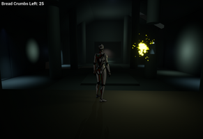
* The game was way too dark. My playtester had a hard time seeing ledges!
* The game was too slow. The walking from area to area takes a while. But I wanted to maintain a sense of scale. How do I find a balance?
* There was a moment of hesitation on where to go. My hallways were too hidden!
* Exploration wasn't obvious at first. So how did I address the changes.
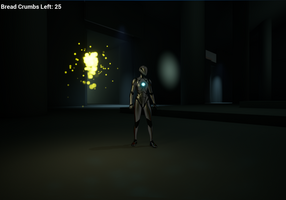
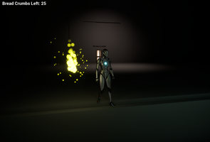
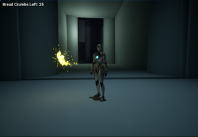
First, I increased the exposure a little bit in engine. This way the player could see more. It's all about finding a balance between keeping your dark values without completely stranding your player. I also added a light on to your fairy companion. I think this has two effects. One, it makes them more comforting as a support system. Two, it lets you see your immediate surroundings! Second, I increased the player's base walking speed. I think this way, the scale of the palace stayed the same while picking up the pace of the game. I also shrunk down the hallways a bit. Did long hallways keep the somber feeling of the game? Nope. So I shrunk them down. Third, I added lights above the hallways.This way, the hallways were way more obvious without directly telling the player where to go. That way, they knew where to go AND they were still exploring. Finally, as for that last point, I think all of these small changes contributed to that feeling of exploration. A lighter environment with less empty space is a bit more inviting to explore. It doesn't leave the player wondering, "Should I go here?" Instead, it leaves the player wondering where they might end up.
I really like this process of applying feedback. I think it's one of the most important aspects of any art and especially video games. It's too often pushed too far back. I think we should be like Valve and we should never stop testing. Test. Test. Test. It's not easy at first, but it is so worth it in the end.
GitHub Link:
Files
Get Game Design 1 Unreal Project
Game Design 1 Unreal Project
Fall 2024 Semester Project to show everything I'm learning!
| Status | Released |
| Author | Dameron Cook |
More posts
- Game Design 1 Week 16 Final UpdateDec 08, 2024
- Game Design 1 Week 11 Overworld DesignNov 04, 2024
- Game Design 1 Week 9 Polished EnvironmentOct 16, 2024
- Game Design 1 Week 4 Essential Emotional ExperienceSep 14, 2024
- Game Design 1 Week 3 AudioSep 06, 2024
- Game Design 1 Week 2 Lighting, Materials, and TimelinesAug 29, 2024
- Game Design 1 Week 1 Update/LaunchAug 22, 2024
Leave a comment
Log in with itch.io to leave a comment.